From Prototype to Full Fledged App
HappsNow was an event ticketing startup trying to break into a saturated market with an approach that simplified the process and made it more engaging for younger users. I was brought it early in the process when all they had was a simple prototype.
Challenge:
I was tasked with taking the prototype and existing branding (just a logo) and designing a full mvp to go to market. Being a startup our time was limited, and as the sole designer I had my work cut out for me.
Objective:
Run through the whole discovery process in an accelerated timeline to go from 0-1 in a tight timeframe.
Company
HappsNow
Role
UI/UX Design, Visual Design, Branding, Front-End Development
Timeline
July 2016 - December 2018
Tools
Photoshop, Illustrator, VSCode
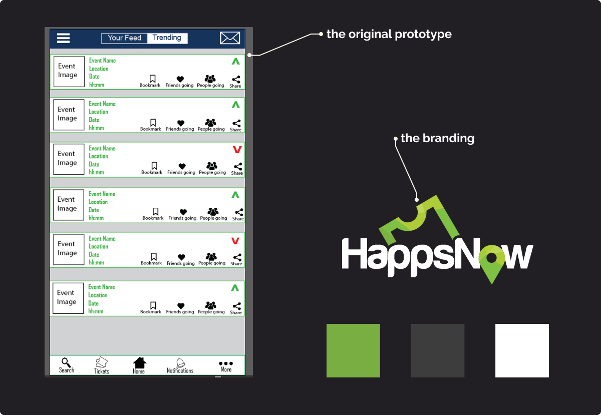
I started by developing a brand language using the existing logo as a starting point. The green paired well with white and dark gray. Keeping the pallette simple allowed us to feature vibrant images for the events and let them shine.
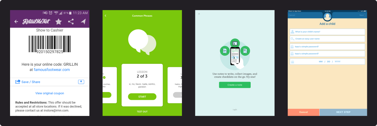
We also, completed competitive analysis: what others were doing right and where we could do it better.
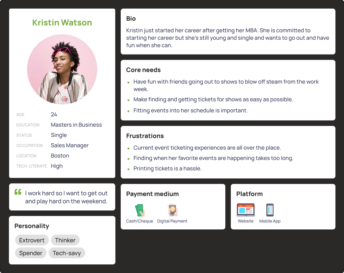
We completed the research phase by conducting user interviews and developing a user persona. We were targeting a younger demographic: college aged and young adults.
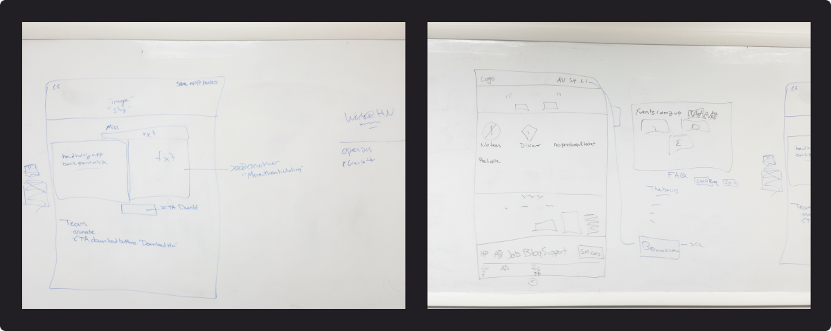
With the research phase done, we got together and worked out all the requirements on a whiteboard. We started with a sitemap and then did sketches of individual pages.
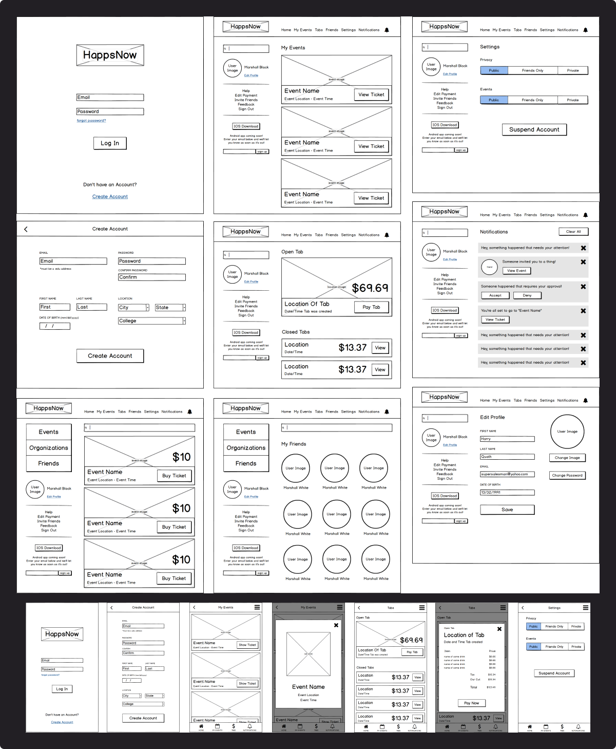
From there I created wireframes of both desktop and mobile screens. We did some initial testing with the team to make sure we had everything and then I was off to the races.
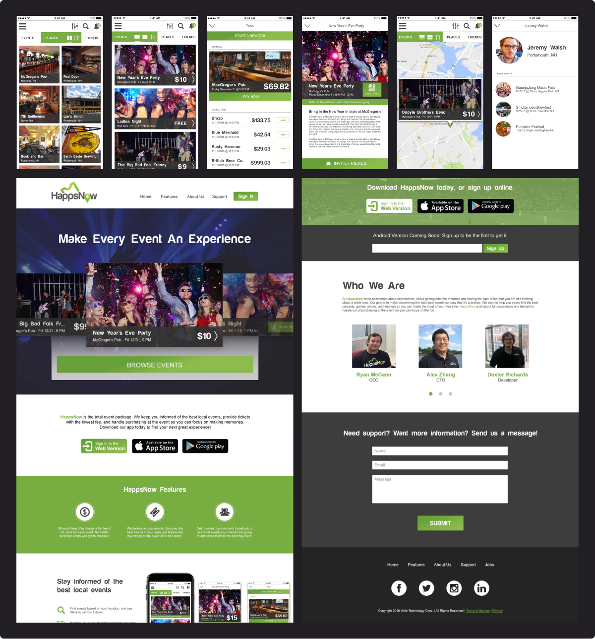
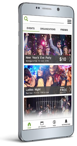
HappsNow was primarily the mobile app with a companion web portal, so the mobile screens came first. I did an initial version of every screen and went through several rounds of design review with the team.
Once we had the mobile prototype ready I got started working on designing the web portal. This was mostly informational at first and later we would expand it out to have the same features as the web app.
We tested it out with some of the people we did user interviews with initially and the response was mostly positive. It was interesting to see where we missed the mark, and what assumptions we made that were wrong. One of the things people wanted was to see the events in calendar form, so we added that.
Unfortunately, as happens a lot with startups, we had trouble getting buy in from venues and promoters. We ran into money problems and most of the team was laid off.
What I would have tracked
Conversion rates first of all. My first mission would have been to find out where we were sticking on conversion. Was our onboarding fast and easy enough to get users in the door? How often were people discovering events through the calendar function over the main feed?
From there I would have set up A/B tests to try different approaches to improve those conversion rates. I would have also refined the email campaigns to increase open rates and click throughs.
Takeaways
I learned a lot through this experience. It was the first time I was the lead or sole designer on any major project. Leading the team through the discovery process and putting out a full product at the end was an amazing experience that helped shape the designer I am today. I made a lot of mistakes and my design skills have definitely improved since then, but it was a valuable learning experience.
Check out another case study
Have a project in mind?
Let's get to work!
Send me a message about your awesome project